Client: Linea Nivnice, a.s.
Nivnice Spirit
Back the Right Horse
Scope of work:
→ Brand Strategy
→ Competitor Analysis
→ Positioning
→ Brand Story
→ Naming
→ Logo & Brand Guidelines
→ Packaging Design
-
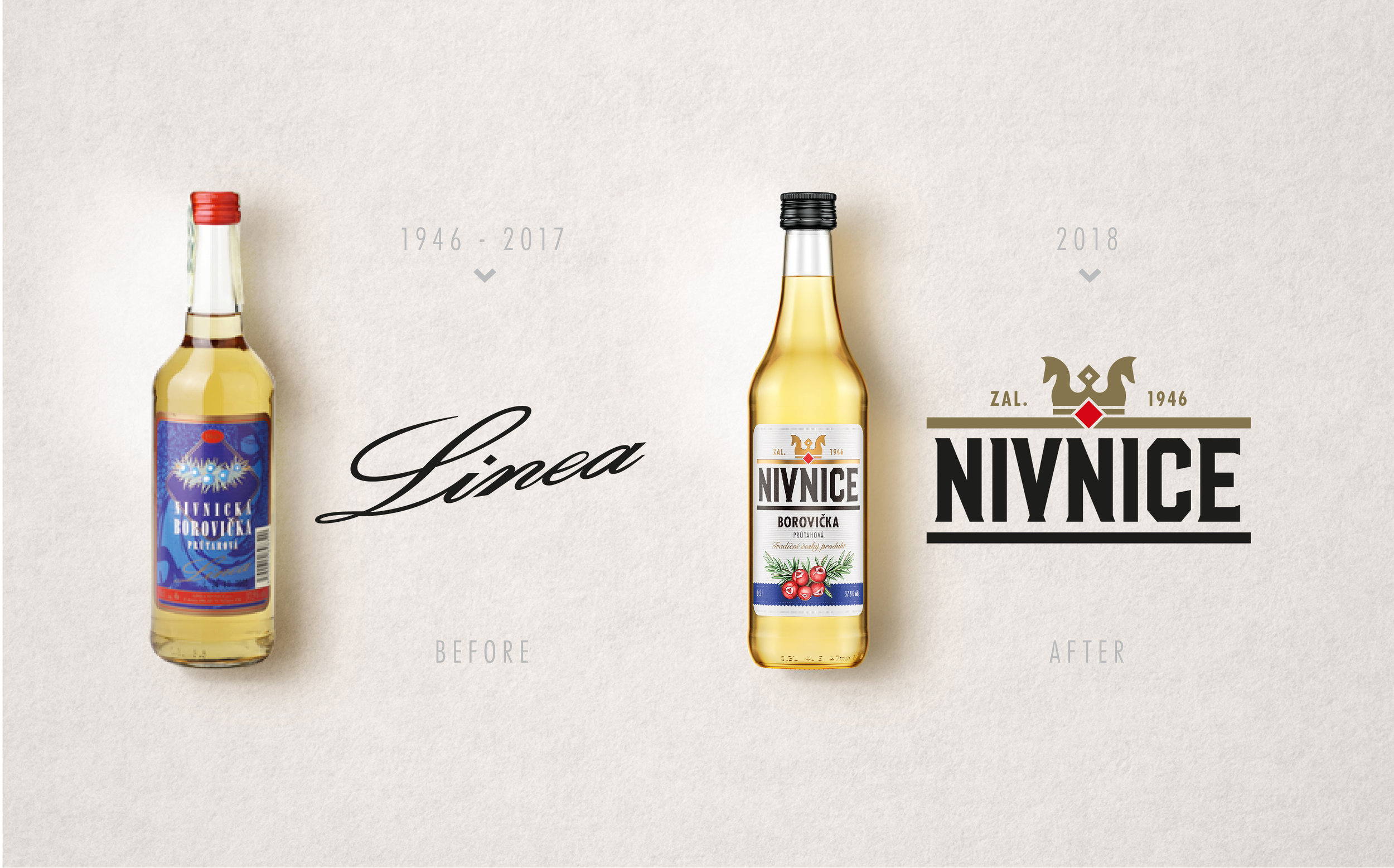
In the heart of Moravian Slovácko, a place shaped by tradition, craftsmanship, and a deep love of nature, an authentic family spirit has been distilled since 1946. Once a proud local icon, the brand had become almost unrecognisable over time.
The owners wanted to restore its soul: a spirit that carries quality, honesty, and a family-first approach in every drop. This was a chance to bring a legacy brand back to life and remind people to “back the right horse.”
-
To honour the brand’s origins while preparing it for the future, I immersed myself in its history, stories, and regional symbolism. Recognising both the emotional depth and strategic opportunity, I brought together a strategist, copywriter, and illustrator to create an identity that felt rooted, proud, and distinctly Czech.
We built the brand from the inside out. Starting with narrative, semiotics, and core values, ensuring every element reflected the spirit’s heritage and the owner’s deep personal connection to it.
-
The redesign introduced a bold, memorable brand: Nivnice.
The new logo brings a confident, ownable icon to the Czech spirits market: a modern expression of tradition, quality, and craftsmanship.From the storytelling to the visual identity, every detail reinforces the message: “Back the right horse.”
A revitalised legacy spirit that finally looks as authentic and premium as it tastes.