Collaboration with Cocoon Prague
Dr.Max Essential
Scope of work:
→ Design Solution
→ Packaging Design
-
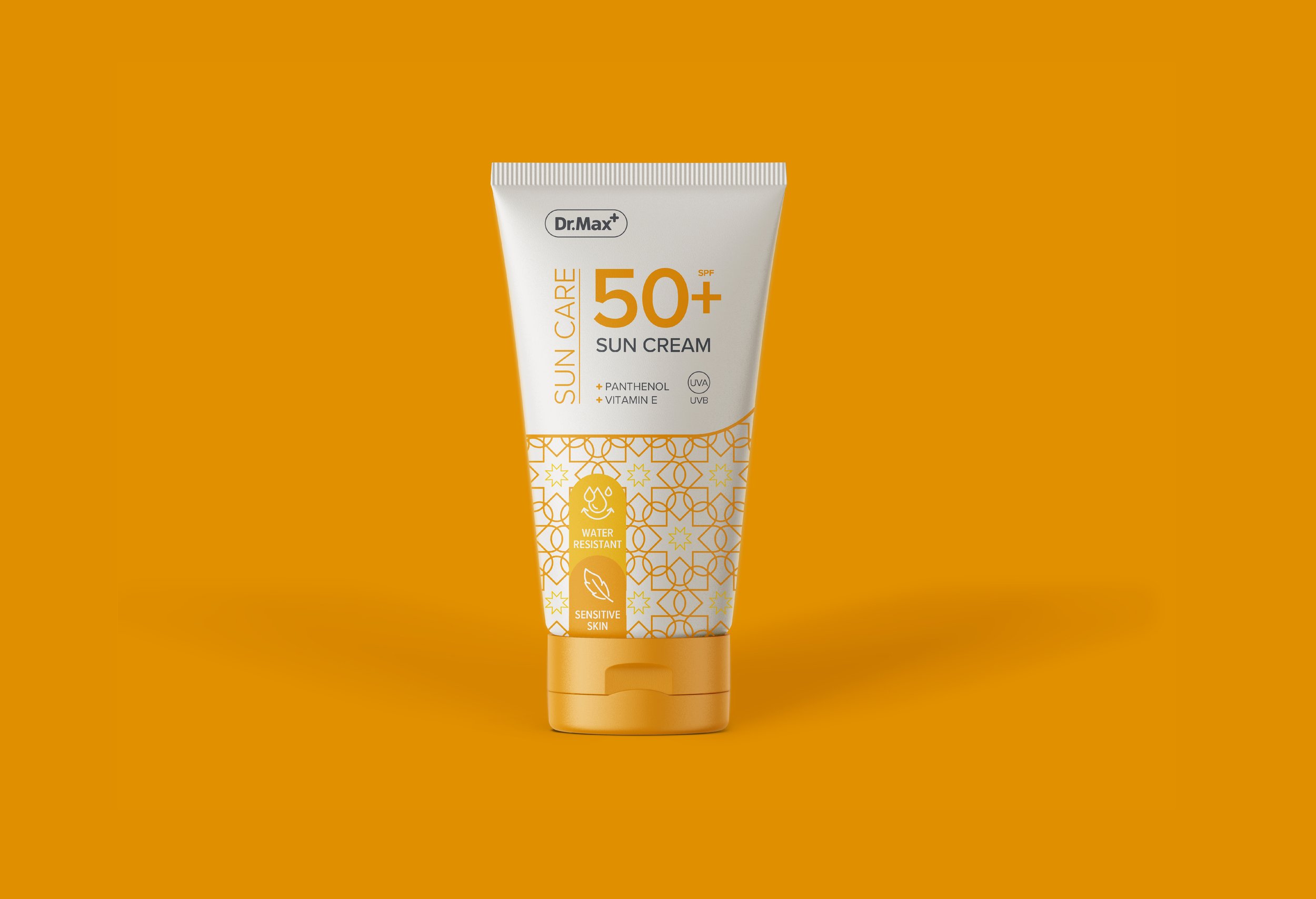
Dr.Max, the leading pharmacy chain in Central Europe, wanted to expand its Essential private label with two new ranges: Beauty and Sun Care. Their goal was to deliver innovative, high-quality, client-centric products while maintaining consistency with their established Essential line.
The challenge: integrate new sub-ranges into an existing brand architecture without losing elegance or cohesion, all while elevating the visual identity for skincare products.
-
I focused on creating a visual language that felt both consistent and distinctive. By leveraging the iconic Dr.Max “+” logo, I developed unique patterns for each range:
Sun Care → subtle sun motifs embedded in the pattern
Beauty → hearts and flowers to convey care, wellness, and femininity
This approach allowed the new ranges to stand out individually while remaining clearly part of the Essential family. Clean, sophisticated typography and careful color coding reinforced hierarchy and clarity for customers.
-
The final design solution:
Elegant, distinctive patterns that subtly communicate the purpose of each range
Seamless integration with the existing Essential architecture, preserving brand recognition
The outcome is a cohesive, intelligent design system that keeps the Dr.Max brand consistent, elevates its private label offering, and works beautifully across retail packaging… all while clearly differentiating Beauty and Sun Care.